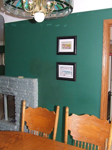
Dining Room Before:

After:
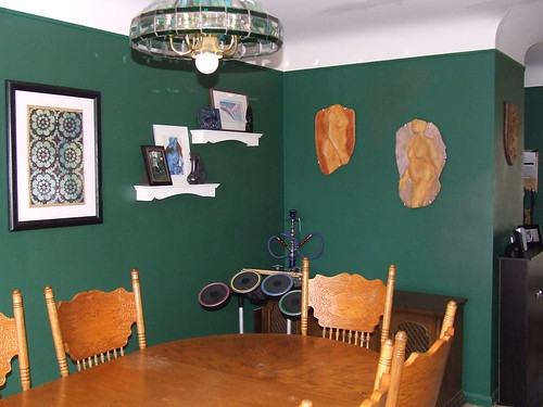
More after the jump.
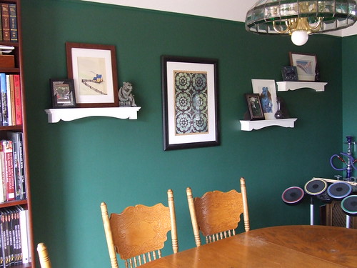
Hearth and Dining Room Before:

After:

Living Room Before:
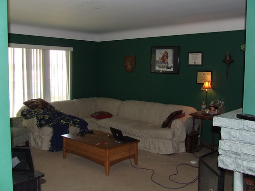
After:
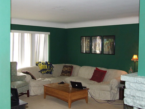
A few more shots of areas with my artwork added:

One thing that I really like about the change is how my stuff pops out from the wall more and has a greater presence. I think that the dark items against the dark walls just becomes too muddied. I grouped the three pieces now in the living room together into a triptych so that they would have a greater presence. As these are posters of artwork created for a trilogy of books, I think putting them together also makes more visual sense.
Now comes the inspiration part of this post: what I would like to do with this area.

The above photo is an image from an Apartment Therapy post that has a very similar wall color. Given that Scott is into really deep colors, not the bright, cheery, Key West sorts of colors similar to the last house I was living in, I am taking inspiration from some other examples of how people have successfully applied color. I really like the feel of the above room.
One of the things I like is that drum light. I have been thinking about something like that even before seeing this photo, because I feel like the one in the dining room screams "Ruby Tuesdays" to me, and I think that a drum light would go well with the style of the house. I have even found a DIY tutorial on how to create one of these cheaply.
Another thing I like is how the items in this room contrast and harmonize with the wall color. I like the soft green fabrics against the dark green wall much better than than the bright red and even the dark brown that we have.
Finally, I think once again that the bright artwork on the wall is much more successful than the dark artwork on our walls. It isn't that I dislike Larry Elmore's work; I think he paints amazingly realistic images of fantasy settings, and I have even created an elaborate Dragon*Con costume of one of the characters in these particular paintings:
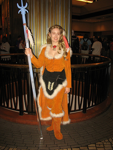
Still, there is something about these images that makes me think they really don't work as wall art the way they do as book covers. I am not sure if it is the composition or the scale -- they are much too intricate to appreciate from across the room at poster size -- I just don't think they work decoratively. They stay, though, because they are important to Scott.
Personally, I think something like the large version of this Tatooine poster would be much more successful over our mantle piece:

It would provide color contrast, good scale, and a large vertical element against the horizontal stone mass of the fireplace, and it would still be about a geeky thing that Scott cares a lot about.
There are some other things in these rooms that we have agreed are going. The shade on the torchere in the living room is broken, plus the whole post leans, so we will need a lamp to replace it. I think that an arc lamp would be a good solution that could get usable light to the middle of the room, where it is most needed. Like this:

I love the way that this modern lamp contrasts with the traditional elements in this room and makes everything pop.
We're also planning on new window treatments -- I detest vertical blinds. Scott plans to make a new dining room table and chairs. We also plan to pull up the carpet and redo the hardwood. Some of these things are clearly further in the future than others.
I also need to post my inspiration photos when I see them, rather than wasting time trying to find them later. This post has taken far too long because I ave been searching for things I know I have seen, and I still haven't found my window treatment inspiration photo.
In that spirit, I would like to share this quick video about secret stash locations. The design and fabrication work are both really beautiful. That office could definitely belong to a spy.
Secret Stash from yiting cheng on Vimeo.
You're so good at costumes! That one's really cool too!
ReplyDelete